Website powered by

One Piece x Fire Emblem

Making Of / 26 May 2023

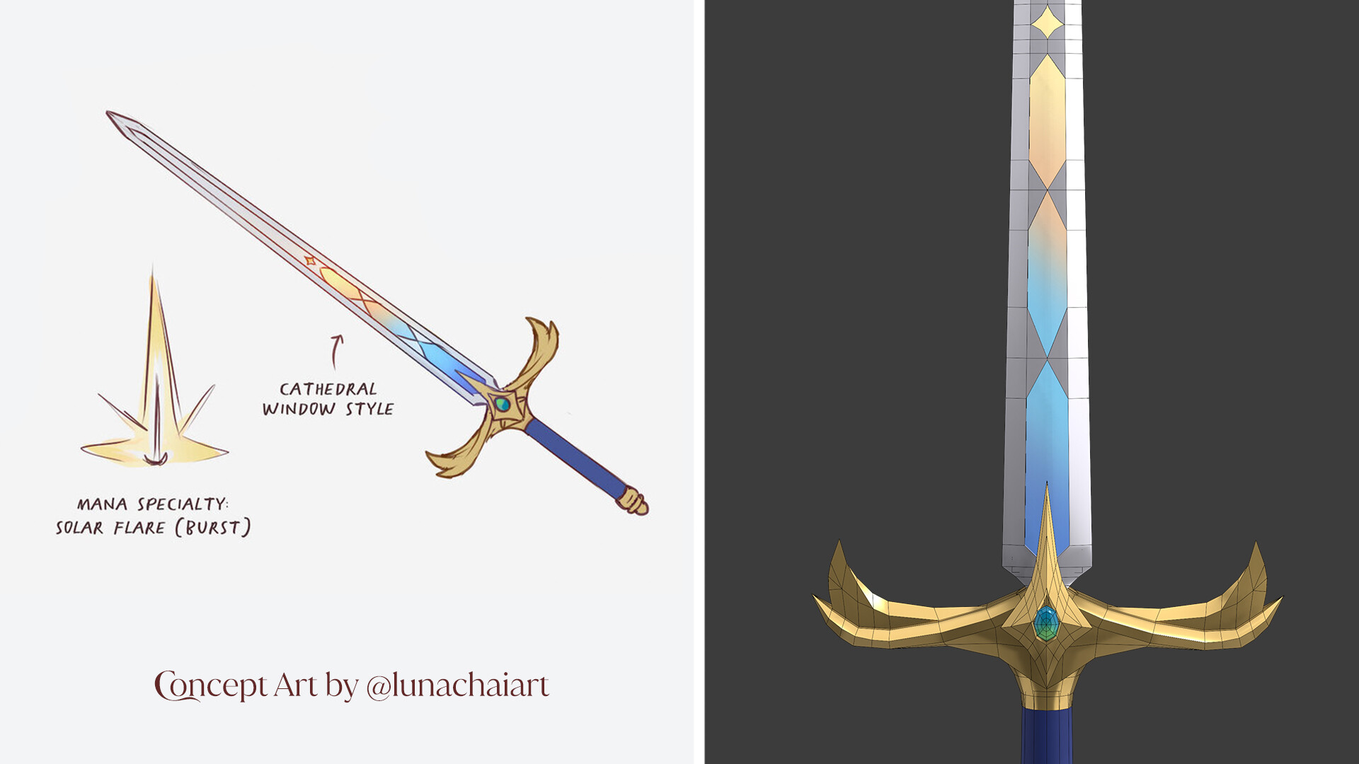
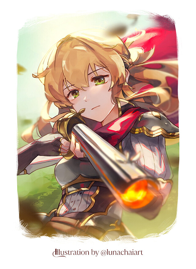
Listen. I am unashamedly in love with both One Piece and Fire Emblem. This project really started as a small idea that kept growing and growing until I couldn't stand it anymore and I just had to make it come to life. It really is an incredibly self indulgent project, but I hope people enjoy it! 

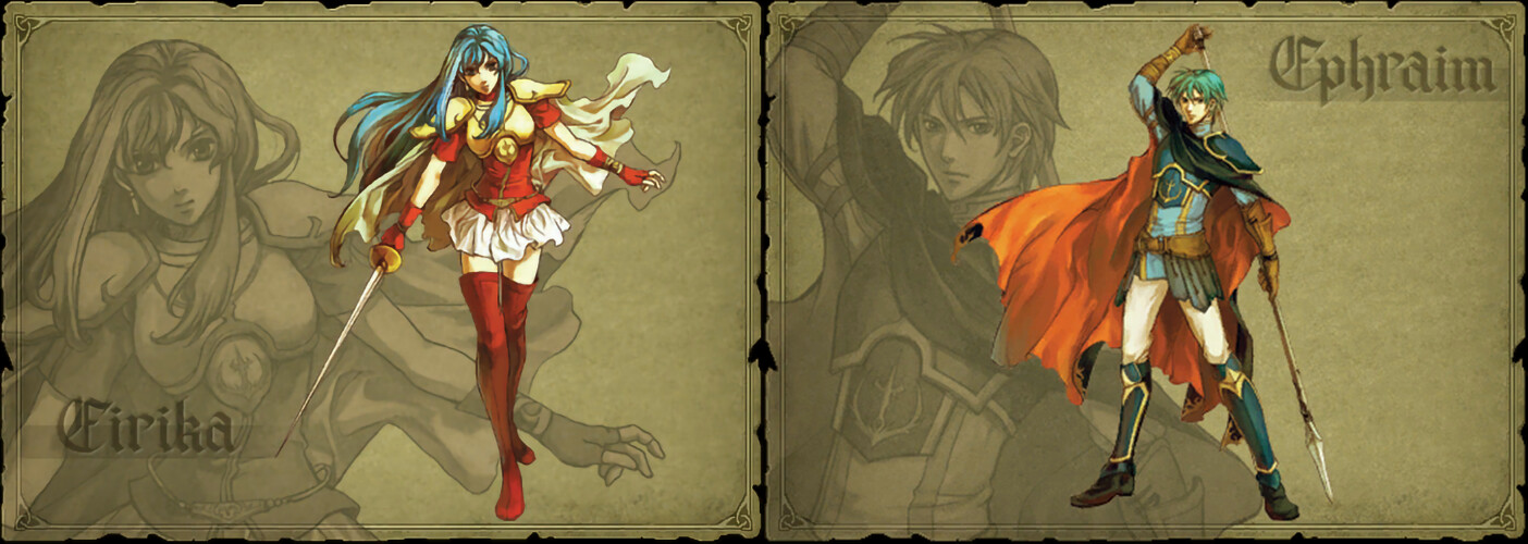
I grew up playing Fire Emblem. It was actually helped to motivate me to learn how to draw. I used to print out official art that I could find online and practice drawing from them. A lot of the earlier games presented their art in a similar format, and I wanted to pay an homage to it with my own art. 

I decided to draw all of the Straw Hat Pirates, because there is a variety of characters and they all have distinct personalities and themes. I had a lot of fun coming up with the classes for each character. Some were easier than others, like Zoro as a Swordsmaster and Usopp as a Sniper. Some were a little more tricky, like what to do about Chopper, Brook, and Jinbe, who all have very non-human designs. I really enjoyed putting the One Piece characters in Fire Emblem style outfits, but sneaking in details from their original character designs. The character that I dreaded the most but also looked forward to the most was Franky. He's completely covered in heavy plate metal, but still had to be recognizably himself. It was a welcome challenge! 

Another challenge was that I wanted each character to reference their theme colors. Most of them were easy to do, but Sanji, Brook, and Jinbe were harder. Brook's colors are black and white, but his post time skip design is very bright and colorful (he's a rock star now!). I ended up using more of his pre-time skip colors. Sanji's colors are blue, but like Brook his post-time skip design doesn't use a lot of blue. It felt a bit like he was resisting wearing blue. Jinbe was an interesting one because his color is Ochre, but his skin!!! Is BLUE!!! I heavily referenced the colors of his Onigashima design. 

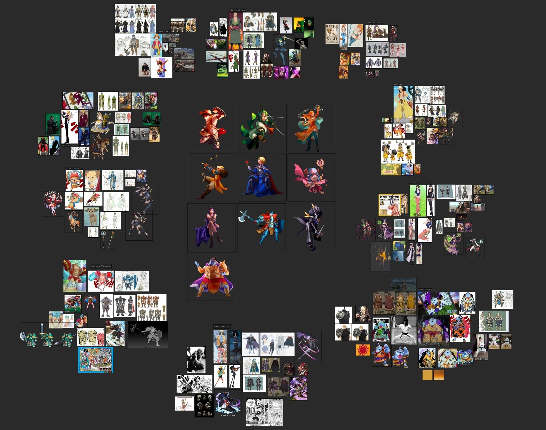
I planned out most of the characters and classes before I even started and had a giant mood board to keep all of my references in. Here's how the final mood board looks

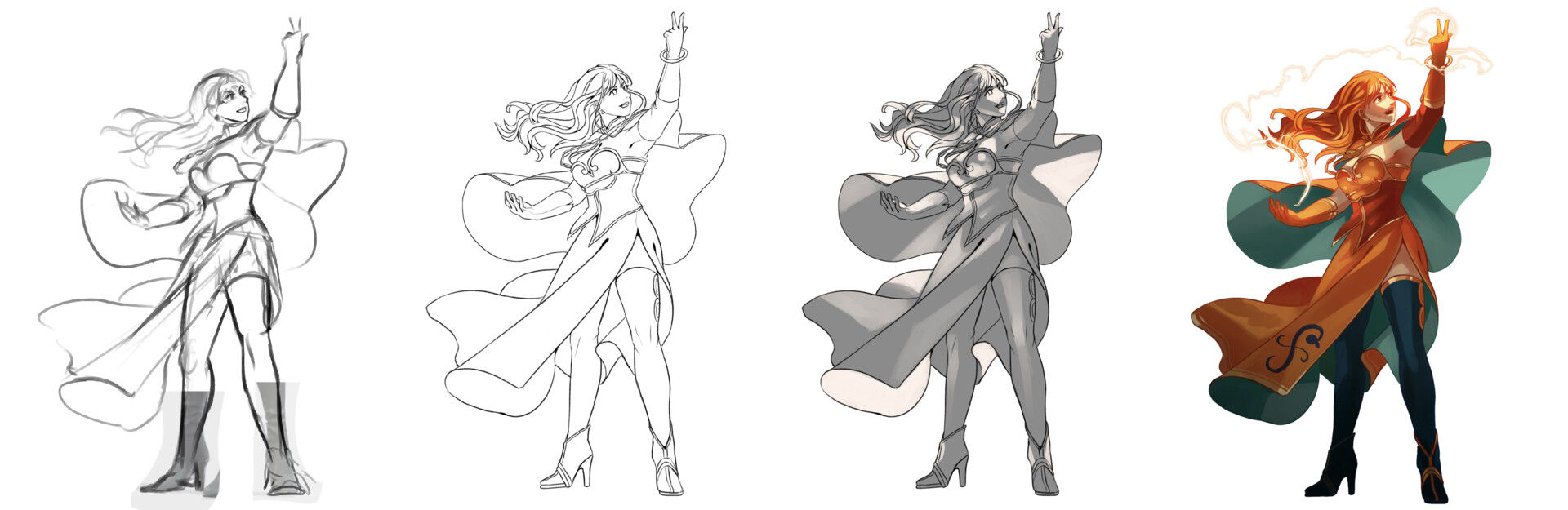
Because I had so many characters and designs to get through, I tried to streamline my process. It ended up being a quick sketch -> lines -> lights -> colors -> render. The speed of each character varied, but I averaged about 5 hours per design. 

This was an incredibly indulgent personal project for me and I enjoyed every second of it! And I'm not done yet, there are still a lot more characters that I want to draw! 

2024 Update:

Happy to say that I suddenly had a lot of time on my hands to revisit this project and add more to it! I love playing around in this world and the enjoyed coming up with more designs for other One Piece Characters. I chose to draw 20 more characters, for a total of 30 full illustrations!

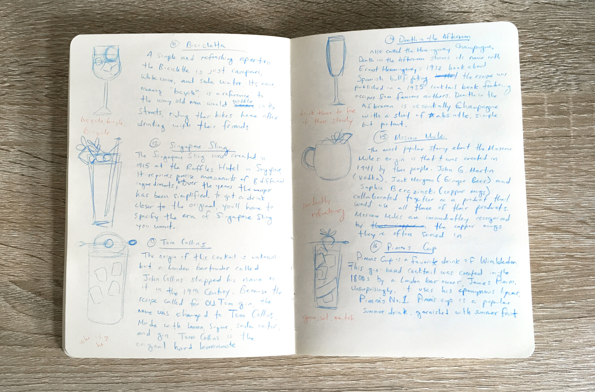
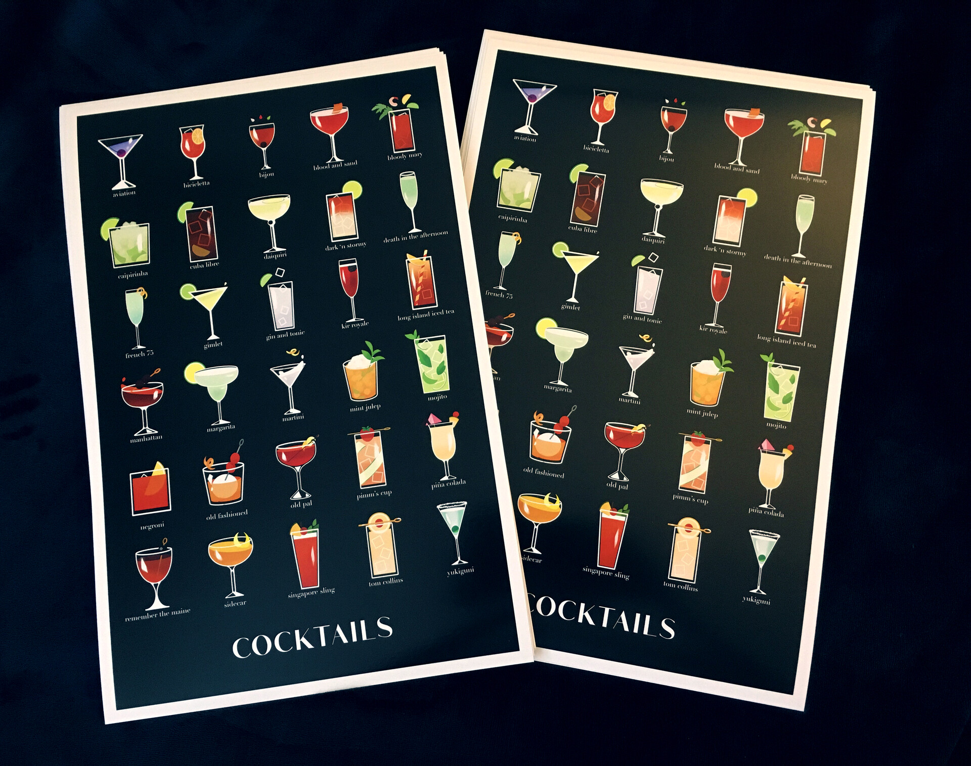
And I'm happy to report that I've compiled all of these illustrations into a book! It was fun laying out the art and writing information for each character. There's something really exciting about being able to physically hold the result of a lot of hard work and love

I don't think I'm ready to say goodbye to this project just yet! I'll be back in the near future to revisit it and draw some more!

Cocktail Illustrations

Making Of / 21 July 2022

I wanted to write down some of my thoughts and feelings from working on my cocktail illustrations. It was a project that I greatly enjoyed working on, and I may want to revisit in a different form in the future.

I am not an expert in alcohol. It would be a gross exaggeration to call me an amatuer. It would even be generous to call me a dabbler. But I've always liked cocktails. They're so beautiful, the colors of the liquors reflecting through the ice and the glass, the garnishes, the way they light up a table. I don't drink at all, but my eyes always are drawn towards cocktails whenever I pass them by. Over time, I also became fascinated by the history and stories behind cocktails. They can be so much more than an enjoyable drink! They can tell the history of a family, the story of a city, an important historical event. The more I learned, the more my fondness of the art of cocktails grew. 

A strong influence on my fascination with the history behind cocktails is the manga Bartender, written by Araki Joh and illustrated by Kenji Nagatomo. Every chapter introduces a new cocktail, with the bartender using the history or the story of the drink to comfort his customers. I enjoyed reading each chapter, and then researching the drinks on my own to check for alternate histories or stories. It made the series an incredibly engaging read and helped foster my interest in the drinks. 

I knew I wanted to create an illustration series about cocktails, so I gave myself a few parameters:

  • I wanted to make it a monthly challenge, where I drew one cocktail a day. Like inktober but for cocktail illustrations. This helped me stay focused on the project for a long period of time, while also limited the number of drinks I could draw. I could have gone on for a LOT longer 😂
  • The drawings had to be consistent and simple. The end goal was to compile the illustrations into a small zine, so it all had to fit together
  • Each illustration would be accompanied by a short summary or story about the history of the drink. There are hundreds of cocktails out there, but I wanted to focus on the ones that I personally found the most compelling. 

To start, I compiled a list of cocktails that I wanted to illustrate. A great resource that I used was The Essential Cocktail Book, Edited by Megan Krigbaum. It's a wonderful collection of 150 cocktails recipes, with photos and short paragraphs about each drink. I also did some research on drinks that I had read about in Bartender so I could include them. One drink that stands out in particular is the Yukiguni, created by Keiichi Iyama in 1958; an entirely Japanese cocktail that you won't find in most cocktail books. 

After some experimenting, I decided to use a very simple approach for the illustrations, much more graphic than how I normally draw. The glasses would be white lines and the ice would be faded outlines. The drinks themselves would be colorful and the garnishes would be lightly shaded. The glare on the glasses would be a rough paint stroke, and that same brush is used as an overlay in the background to add some texture and glow to the background. The backgrounds would be solid colors that make the color of the drinks stand out, while not repeating colors from day to day. At first I had the text as white against whatever color the background was, but it quickly became difficult to read against brighter colors, so I switched to having a white block on top of the background, and having the text be a darker version of the color. Everything was created in Procreate, on my ipad!

With my style decided and my list of drinks, it was just full steam ahead at that point! I wanted my summaries to be original, so I wrote them after compiling my research. I tried to keep most of them around 3-4 sentences long. For each cocktail I would sketch out how I wanted to draw the drink, then write down the summaries in my sketchbook. After that I would open a template in procreate, write in the summary, then draw the cocktail. Once I got started in earnest, each drink would take a little over a half hour to complete! Here's an example of what my sketchbook looked like for a month.

To keep myself accountable, I shared one drink a day on twitter in a thread. It was fun to come up with even shorter blurbs to attract people's attention to the tweets. 

After I completed my list of cocktails, I compiled them together into a little zine! At this point, some of my color choices were not very smart in hindsight. Those jewel bright colors did not react well to being converted to CMYK. At one point I was converting the colors and my roommate said "I've never heard you make such a sad sound". I was able to bring back some of the colors with some adjustment layers, but I also had to just live with some of the duller colors. At the end of the day, I'm quite pleased with the results!


I also decided to make it into a poster! But since there were 31 cocktails, I had to get rid one so they would fit. Goodbye Moscow Mule, you were the odd one out... but I feel like the poster came out really well! It looks stylish~

I had a wonderful time creating this project. I learned a lot while working on it, and was able to share my fascination of cocktails with people. I'd like to revisit this project at a later date. Maybe instead of cocktails, I can do something about the history of specific alcohols. Japanese Whisky has a very romantic story, and the history of Baijiu is the history of China itself. We'll see what the future has in store for me. Something to look forward to!

Exporting models from Blender to Procreate

Tutorial / 20 November 2021

This isn't going to be a tutorial so much as some of my observations on importing models into Procreate from Blender and some rules I've discovered that aren't in the documentation. 

Some quick background information about where I'm starting from! I'm a 2D/3D artist with considerable experience with both procreate and most aspects of the 3D pipeline. Some of my thoughts might not be applicable to someone who is new to either 3D or to procreate. The iPad I use is a 1st generation iPad Pro with 2GB of RAM and an Apple Pencil. Some issues that I had are entirely hardware related and can be fixed by just getting a new iPad 😭

Procreate 5.2 introduced 3D painting, which lets users paint directly on imported 3D models! This is incredibly exciting, and I was especially excited for the potential to paint on 3D models on my iPad. I personally find it uncomfortable with painting on my computer tablet and do all of my digital painting on my iPad. 

I was so excited for the 5.2 update that I spent the day before the update preparing some of my old 3d sculpts to be imported! The one I ended up using was this one of a guardian lion, sculpted in Zbrush and hastily retopologized and UV-ed. It wasn't optimized in any way, but it'll do! I was finishing dinner when the update arrived and downloaded it right at the kitchen table. And then I proceeded to paint on the lion model without moving from the table for an hour and a half. Painting in 3D! At the kitchen table! What a dream~

My initial reaction was that the 3D painting feature is AMAZING. It runs so smoothly even on my old iPad, that it made me cry tears of joy. I was immediately comfortable with the navigation and intuitively understood how the lights and texture maps worked. If you have any experience at all with hand painting textures, the transition to procreate is smooth. If you want to learn more about the basic features, Procreate has a very useful handbook that they keep up to date with any new features. They explain the file types that are compatible (.USDZ or .OBJ) and what UVs are. Procreate won't accept models without UVs. 

EDIT: Procreate has added a tutorial on how to import models with larger maps, normals, and AO [HERE]

I've seen tutorials on how to get models from Forger or Nomad Sculpt into Procreate, but I wondered what the steps were for Blender. I chose a different model that had more pieces and multiple UVs to test with and made note of some interesting behaviors. For the most part, the pipeline is pretty simple. Export to .OBJ, upload the files to your iPad via dropbox, airdrop, etc., import files to Procreate.  

(1) Like a lot of 3D programs, Procreate likes Quads and Tris. But it doesn't seem to know what to do with n-gons. It'll literally just make those faces disappear, which is kind of funny. This has an easy solution; just triangulate your mesh before you export! Problem solved!

(2) You can import models that have pieces with different UV sets. I knew Procreate could handle multiple objects with different UV layouts, because some of the sample files have that. Assign the objects different materials before you export, or Procreate will assume they're all using the same texture. 

(3) Related to (2), there is a layer limit in all Procreate files, and the number of layers you can have depends on how powerful your iPad is. As a 1st generation iPad, I have a very pitiful layer limit! I've learned that the layer limit also applies to the number of UV layouts you can have. I organized my scene into 6 different layouts, but that's over my layer limit so procreate brings up an error when I try to import the full scene 😭

(4) If multiple objects share the same UVs, stacking them on top of each other saves on space and time, since you'll only need to paint one and it'll repeat on everything in the stack. Procreate did something interesting when I tried to paint on the birds, which all have the same UVs. It didn't let me paint on any of the birds except one of them. I think it only lets you paint on the object that's on the top of the stack, so to speak. It's not that big of a problem, but it did lead to me spinning the model around a lot, trying to find the right bird to paint on.

There are a few other notes that I made that others have addressed, such as how to get the textures to 4K in procreate, since it defaults to 2K textures. I just wanted to share my thoughts and observations in importing from blender with a variety of different objects. 

Overall I am very impressed with how Procreate handles 3d models. It doesn't seem to have any issue at all when importing large models, as long as they have a UV map and no n-gons. I actually imported a photogrammetry model that was about 700k Tris with no problem at all. Most of the issues that I personally had were hardware limitations on my end not liking the layer limit. That does prevent me from using the 3D painting feature more, but if I ever get a better iPad then I'll be happy to revisit!

Airlean Tales 3D Models

Making Of / 15 November 2021

I was approached by Luna Chai to create a series of 3D models for the series Airlean Tales. The models were made to be imported into CLIP STUDIO PAINT, for use as painting reference for the illustrations. These models include weapons and some extra objects like a mask. I've never created models for CSP before, but I decided to create them with a lower polycount so they would be easy to open in any program. My own experience with CSP is on my iPad, and I know it sometimes struggles with heavy 3D models! So for this project, I focused on creating models that were accurate to the concept art and didn't have a terribly high polycount.

Final project page can be found HERE. Unless otherwise noted, all models were made in Blender. All concept art is by Luna Chai!

Karis's Sword

  • Karis's sword resembles a rapier, but the guard is shaped like a plum blossom and inverted. The knuckle guard is elaborate and wraps around the handle of the sword. It's very pretty!
  • This was the first one I made, so I was figuring out my process at this point. The hardest part was the knuckle guard, because the form is delicate and beautiful, tapers differently across the entire guard, and it wraps around the sword in a way that would be difficult to do with box modeling. I used curves and a curve profile to make it, which allowed me to make it smooth, tapered, and easily editable. 


Azalea's Gun

  • Azalea's Starshooter Gun is based on a rifle, with a colored inner casing and handle, and gold vines that wrap around the trigger guard. I liked how organic the vine detail felt, but I also decided to make sure the actual trigger guard area was straighter so it could do it's job like a real rifle.
  • Like Karis's Sword, the gold vine detail was made by extruding a curve profile along a curve. The vines were easier than the sword guard because the profile is simpler and there's only a little bit of tapering at the very end of the vines. 
  • Initially there was only a side view of the gun, but Luna generously provided me with notes on how the details look from the quarter view. 


Wes' Goggles

  • After two fantastical weapons, Wes's Goggles were comparatively simple! These goggles have large lenses and wreath themed clasps on the sides. 
  • Because it's a symmetrical object, I was able to model half of the goggles and then mirror it to save time. I modeled everything on a flat plane, and then curved it to fit around a head. 


Dragon Whisperer's Mask

  • The Dragon Whisperer's Mask was a fun challenge! It's a hard surface piece with very organic shapes. Not only does the mask conform around a face, but there are details that are conformed around the mask! I worked in Zbrush to make the mask, then I brought it into Blender to retopologize. I'm happy with how neat it came out!
  • ZBrush - I used a generic base mesh for the head, editing the proportions to match the character closer. To make sure the mask fit the head perfectly, I masked out the area the mask would be and extracted it to use it as a rough base to work from. It was challenging to sculpt because it was so thin! At first I had the horns going more to the side, but Luna directed me on the correct rotation. I used ZRemesher to simplify the horns, but I wanted to be picky about the topology of the mask, so I brought that into Blender.
  • Blender - I wanted the mask to be efficient with it's polygon count, so I carefully went in and drew in the new topology with the Shrink Wrap Modifier. I did the same for the raised detail on the mask. My goal was to preserve the curves and hard edges I had with as few polygons as I could. Looking back I probably could have used even less, but I'm happy with how it came out. For the horns, I deleted the edges they didn't need until they only had enough to keep their essential shape. 


Echo's Dagger

  • Echo's Dagger was another object that started it's life as a Zbrush sculpt. This hunting dagger is made of bone and has a wolf head detail on the end. The final head is a lot less detailed than the initial sculpt, but this is by design. The dagger itself is a small detail, so it was more important for the head to have large readable shapes than be highly detailed.
  • Zbrush - The character sheet had another object with a wolf head that I used as a reference since it was more detailed. I had to look up a lot of references on how a wolf head is shaped, as well as some metallic wolf sculptures to see how fur is generally sculpted. 
  • Blender - Like the Dragon Whisperer's mask, I retopologized the head using a Shrink Wrap Modifier. The wolf head was harder to do than the mask because of all of the fur detail! It was challenging to keep the shape accurate while still trying to only use as many polygons as I needed. The rest of the dagger was created in Blender as well.


Halcyon's Glaive

  • After two models that relied on sculpting and retopology, Halcyon's Swansong Glaive was back to the basics! The general shape of the glaive was straightforward, but I asked Luna for clarification on neck area, since the sketch wasn't clear. There is an attached tassel in the concept art that I was told to leave off, since that can be drawn in later (I completely agree, I also enjoy drawing tassels!)
  • A lot of the gold detail areas were modeled as a small piece and then mirrored twice. This saved a lot of time in modeling. A small detail in the neck was created with my old friend, curve modeling. The blade's shape came out very cleanly, I'm quite happy with it!


 Sethis's Sword

  • Sethis's Sword was the last model I made for this project! It looked simple, but had some details that were interesting to interpret, like the hilt. When I was modeling the hilt, I added a few more segments, but it ended up looking like a bunch of bananas! I quickly changed it to something more cool.
  • My only regret was not leaving enough of an allowance between the edge of the blade and the window segments to allow myself room to add a bevel there. I think a small bevel would help catch the light and really frame the window parts of the sword nicely. Alas, when I try to do it now, it messes with the nice straight edge of the sword's blade. 


After making each modeled I zipped them up and sent them to Luna. I've been told that the models work well in Clip Studio Paint! Mission accomplished!

This was a fun project to be a part of, and I enjoyed how beautifully each design was and how they presented different challenges. Luna Chai was a wonderful client who was enthusiastic and provided clear feedback and communication during the whole process. I did underestimated how long it would take for me to make each model, so I'll learn better for next time. I can't wait to see the models used in the Airlean Tales illustrations.